
Uncovering Why Motivation Drops Before Progress Happens
Learning something new is exciting for the first few days, until motivation fades and progress becomes invisible.
Through interviews, users revealed three major barriers:
They struggled to stay accountable without reminders or structure.
They had no way of knowing if they were improving over time.
Free resources online made it hard to justify paying for guidance.
“I think it would depend on the price range, there are so many free videos already.” - Angie
“Reviews and recommendations are really important to me.” - Sam
“Seeing my progress is what really matters for me.” - Hadley
Users didn’t lack interest, they lacked proof that their effort was paying off.
The challenge was clear:
Make progress feel visible, achievable, and worth continuing.
Redefining the Experience to Build Consistency
My goal was to design a learning companion that supported momentum, not just completion.
I focused on three core outcomes:
Increase Motivation – Celebrate micro-progress and make every step feel rewarding.
Strengthen Accountability – Use reminders and streaks to reinforce consistency.
Create Clarity – Break large goals into small, manageable daily actions.
The target wasn’t just usability, it was sustained engagement: helping users stay consistent long enough to succeed.
Creating a More Engaging, Momentum-Driven Experience
Usability testing revealed that the design made learning feel exciting instead of overwhelming.
What Worked Well:
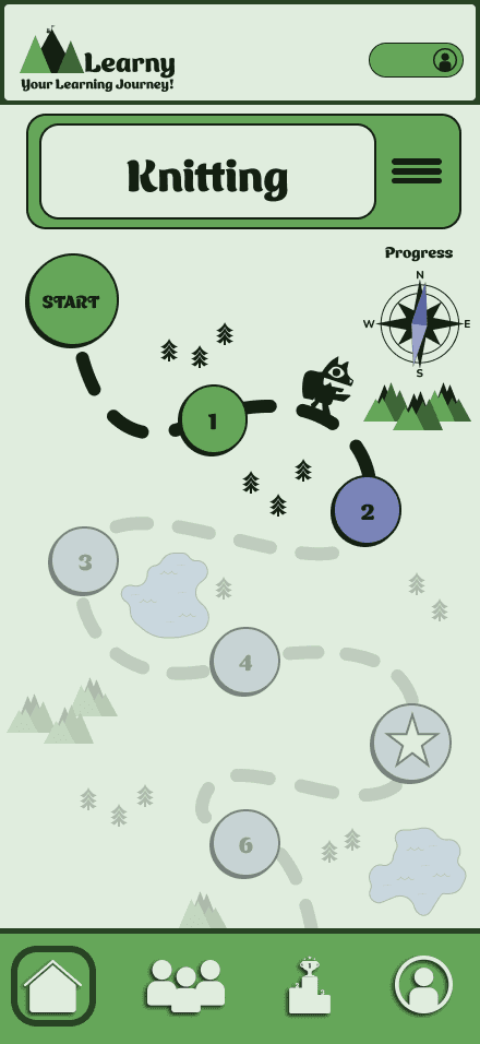
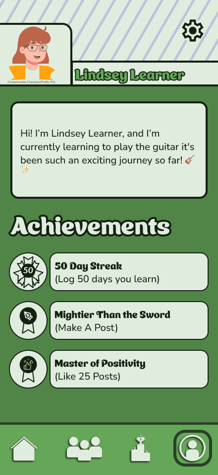
Progress Tracking: Made progress visible and rewarding, users loved “seeing growth.”
Gamification: Kept users engaged without adding complexity.
Flow Simplicity: Users described it as “simple,” “fun,” and “easy to stick with.”
Pain Points Identified:
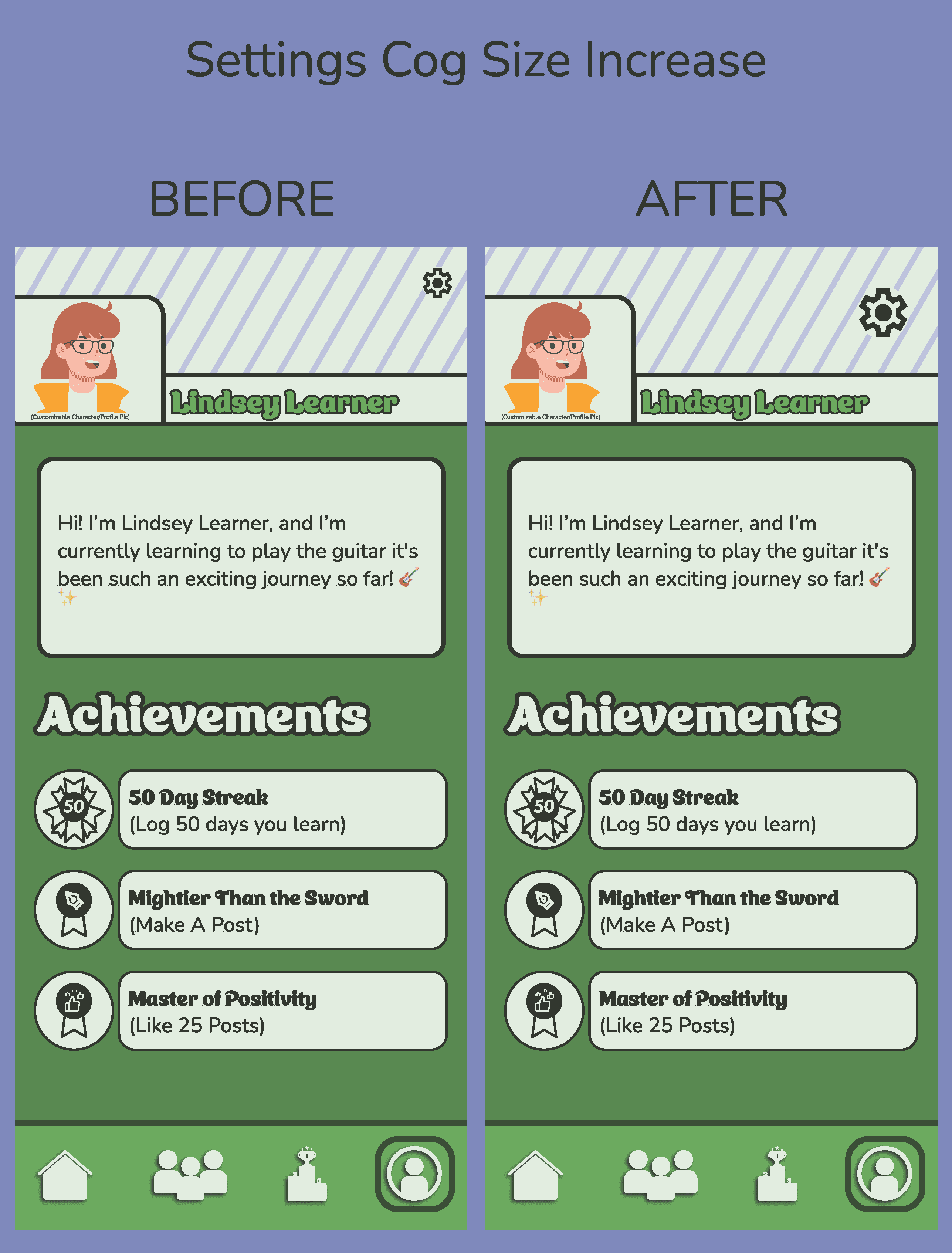
Small tap targets slowed progress (especially the settings icon).
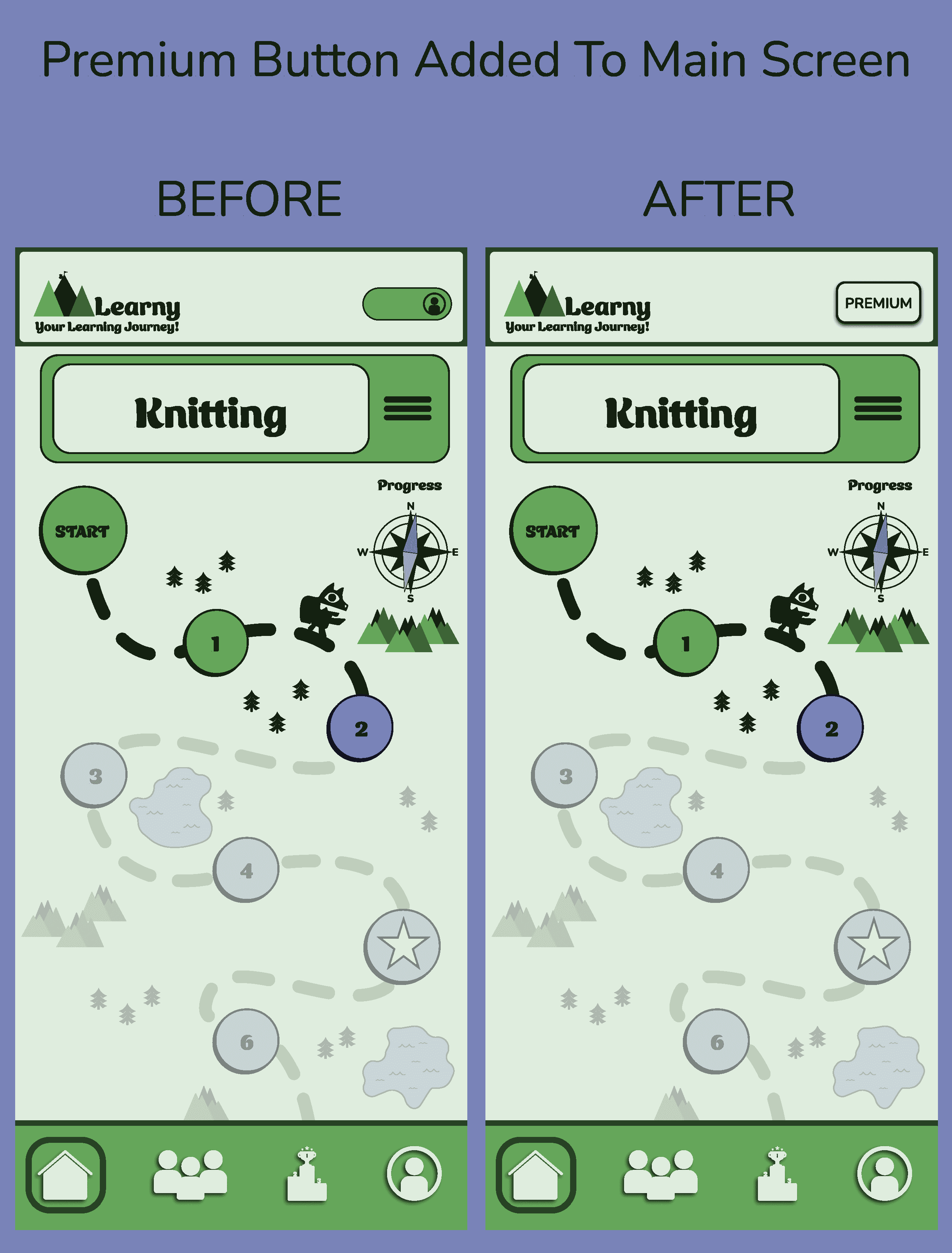
Users wanted a faster path to upgrade to premium from the main screen.
The impact was clear:
Reducing friction increased consistency, and consistency led to motivation.
Mapping the Experience to Reveal Opportunities
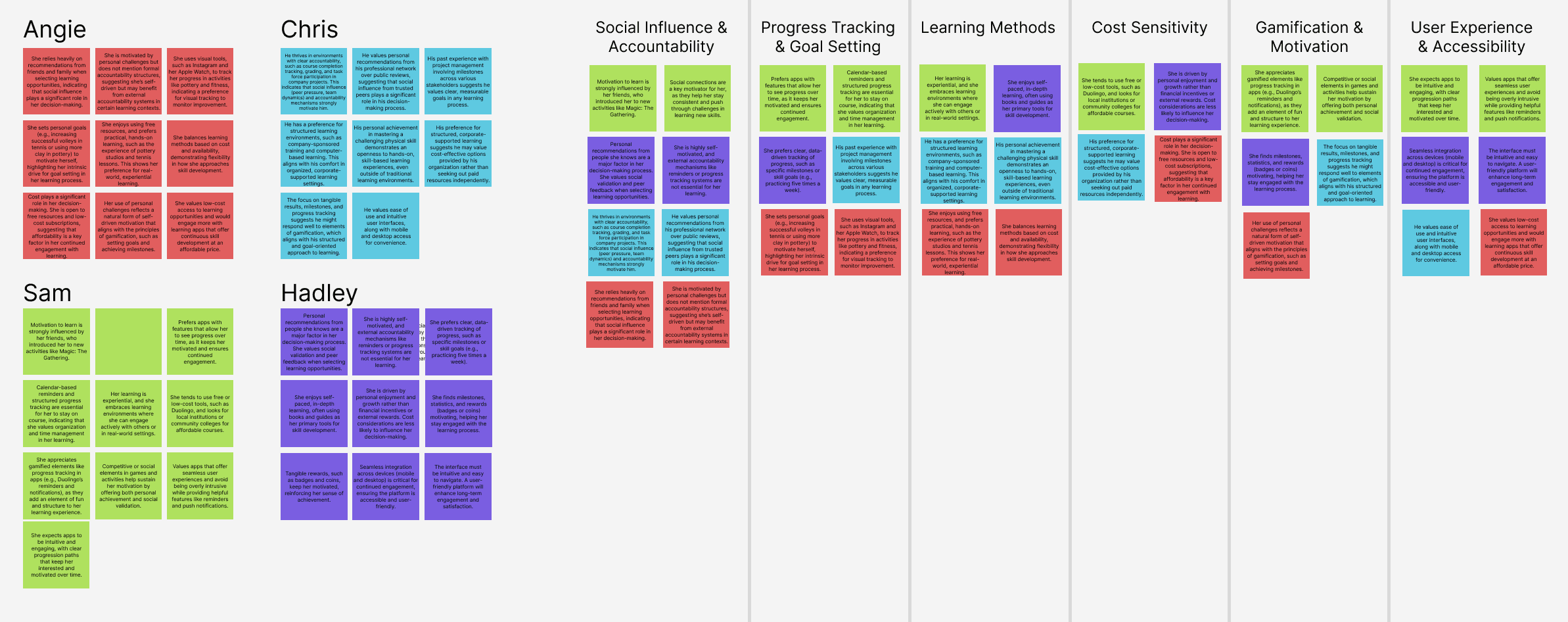
I grouped user insights from Angie, Chris, Hadley, and Sam into themes of social influence, progress tracking, experiential learning, cost sensitivity, and gamified motivation. These insights revealed clear gaps, Learny’s current skill-building experience risks disengagement from fragmented tools and missing accountability, while lacking the intuitive progress dashboards, social validation, and low-cost gamification that sustain learners on platforms like Duolingo or corporate training apps.
Learny users, from self-motivated explorers like Madison to budget-conscious hobbyists like Lindsey, struggle with discovery friction, cost barriers, and fragmented options, as quality local classes hide behind paywalls, expensive subscriptions deter commitment, and hands-on experiences remain hard to find affordably. Learning adds value for personal growth and practical skills but feels inaccessible without peer-validated recommendations, flexible pricing, or geolocated discovery. Key needs include social progress sharing with friend recommendations, low-cost/freemium access with premium upgrades, geolocation for nearby events and classes, and self-paced, interactive lessons to drive engagement, retention, and real-world application across independent and cost-sensitive learners.
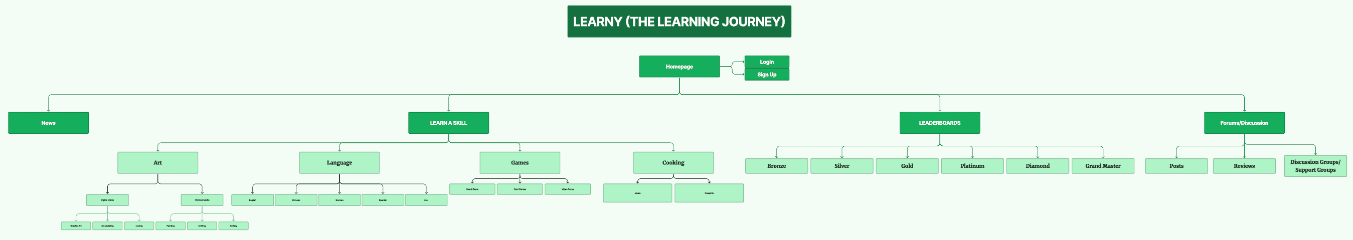
The proposed Learny user flows enable seamless onboarding, skill exploration, and tiered access by opening the app, accessing the Dashboard, and branching into three core paths:
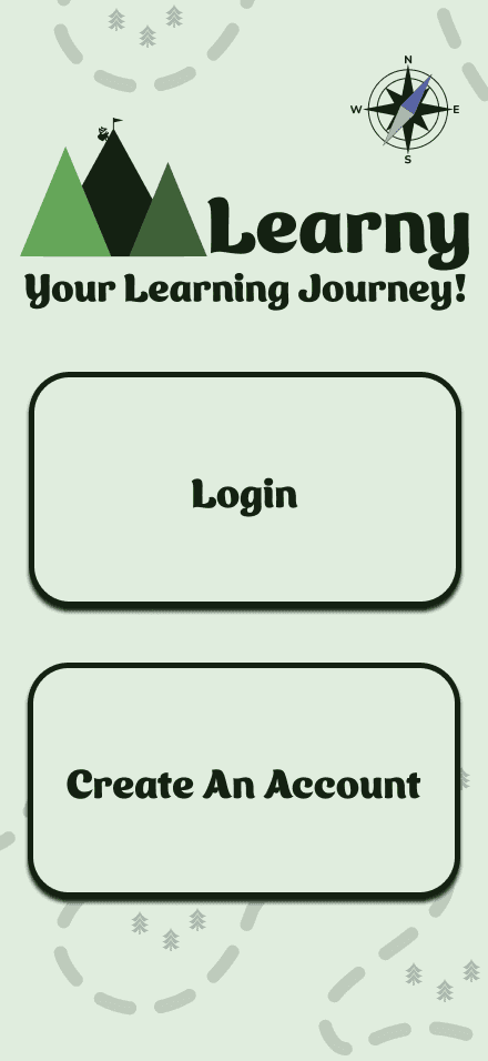
Signing Up - choosing Login or Sign Up, entering credentials, and landing on the Dashboard with error handling for invalid inputs;
Freemium → Premium - selecting a plan (Free or Premium), entering payment details if upgrading, and confirming plan changes;
Choosing a New Skill - navigating to the Skills Page, selecting a skill, confirming commitment, and seeing a “Congrats” screen.
Users return to the Dashboard from any point without resetting progress. This addresses discovery friction, cost barriers, and engagement drop-off by centralizing intuitive sign-up, flexible monetization, and motivating skill selection, delivering accessibility, affordability, and sustained learning momentum across self-paced and budget-conscious users.
Affinity mapping showed where motivation dropped (typically around week two).
User flows were designed to reinforce progress exactly at the moment motivation fades
Simplifying Navigation Through Thoughtful Wireframes
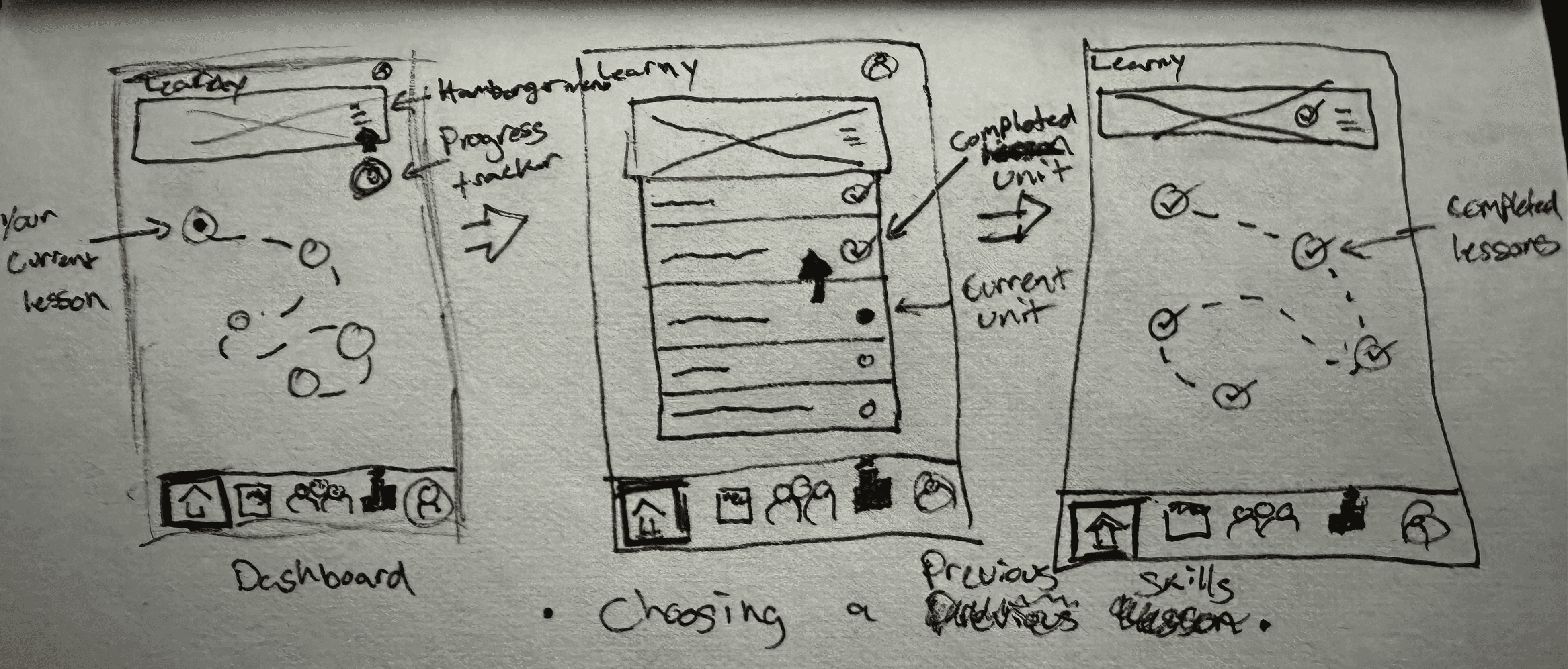
Taking the time to design Learny's Lo-Fi wireframe where the emphasis was on the gamification was a challenge to come up with and express when it came to the layout, but once I got the concept everything else fell into place.
Brand Values
Fun - Learning feels enjoyable and playful, not like a chore.
Adventure - Every skill is a journey that encourages exploration and growth.
Accountability - Tools and reminders help users stay committed and follow through.
Connection - Learning is supported through shared progress and community.
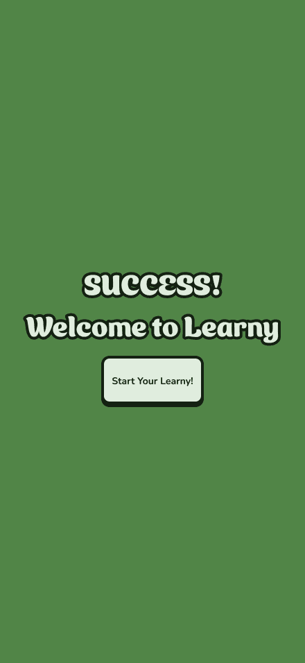
Success - Users see their achievements and celebrate meaningful milestones.
Motivation - Progress tracking and nudges keep users energized and moving forward.
Discovery - Learners explore new interests and uncover unexpected passions.
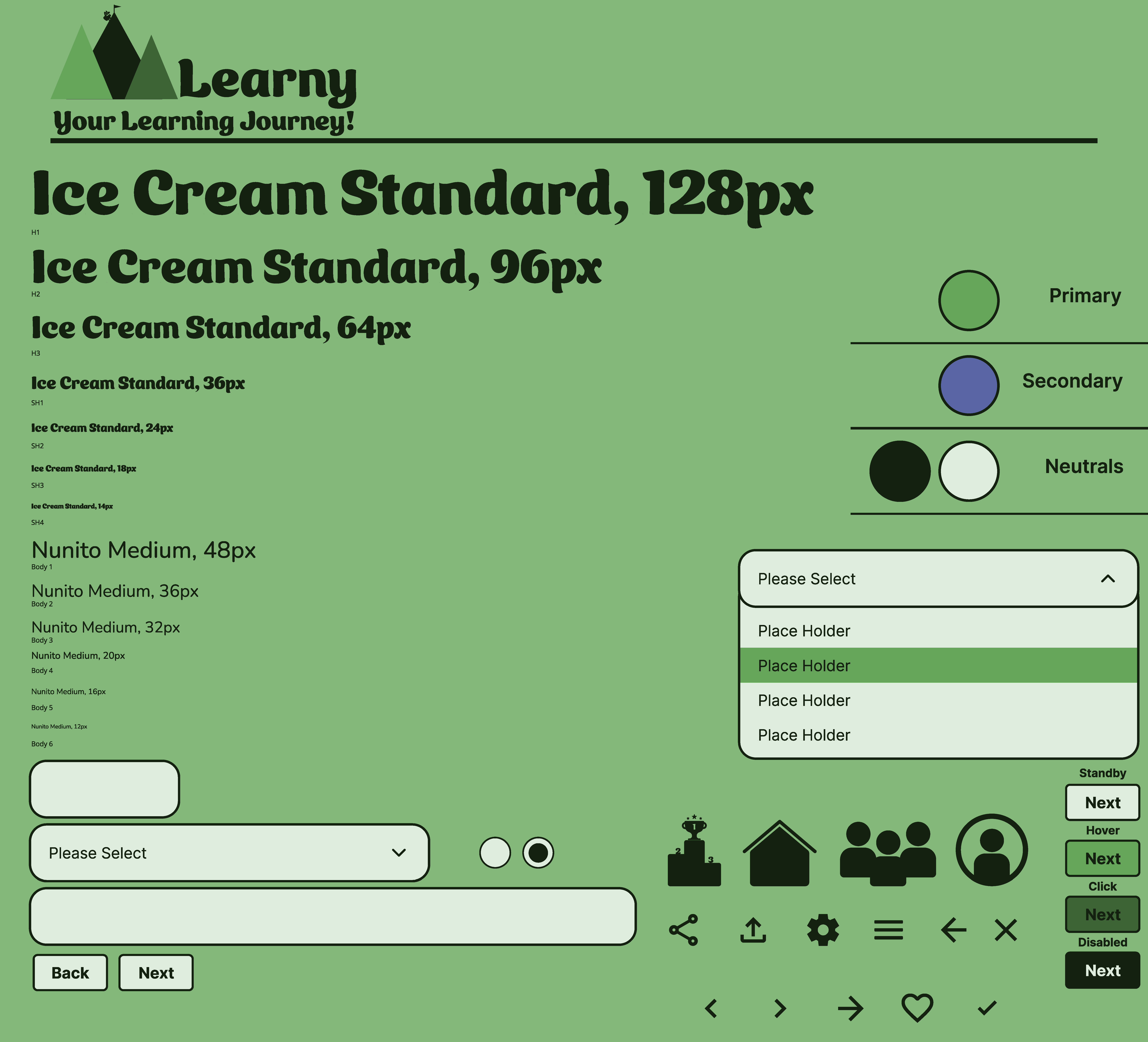
Branding Color Palette
This palette was chosen to reflect a grounded, nature-inspired personality that supports the brand values of Adventure, Accountability, Connection, and Discovery. The green primary represents growth and forward movement, making it a natural fit for motivation and exploration. The muted blue secondary introduces a sense of trust and calm, reinforcing accountability and thoughtful connection. The deep forest green neutral adds a layer of stability and seriousness, while the soft mint brings balance through its light, approachable tone. This palette leans more reflective and steady, prioritizing trust and purposeful discovery over high-energy expression, which makes it slightly more subdued in terms of fun and playfulness.
Keeping with a simple UI and Visuals to make Learny feel friendly and fun to use was my main goal when fleshing out the design.
Lo-fi wireframes focused on:
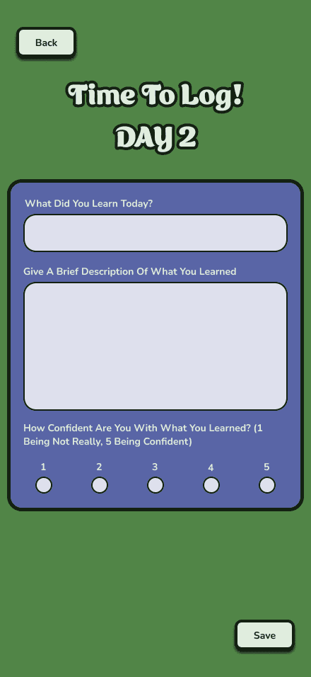
quick logging,
clear streaks,
visible progress.
Hi-fi design reinforced momentum, celebrating progress through visual rewards and encouraging language.
Validating Through Usability Testing
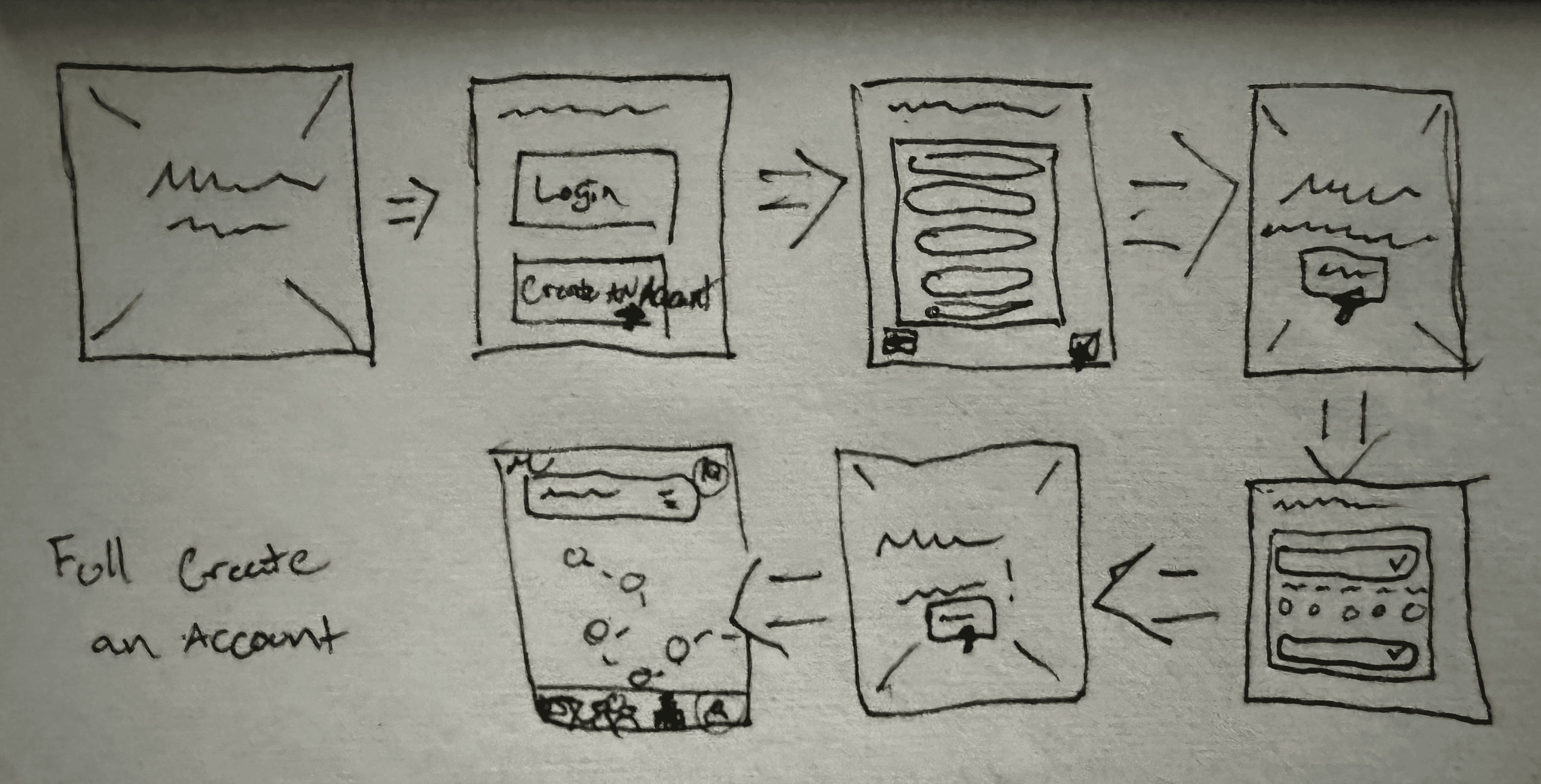
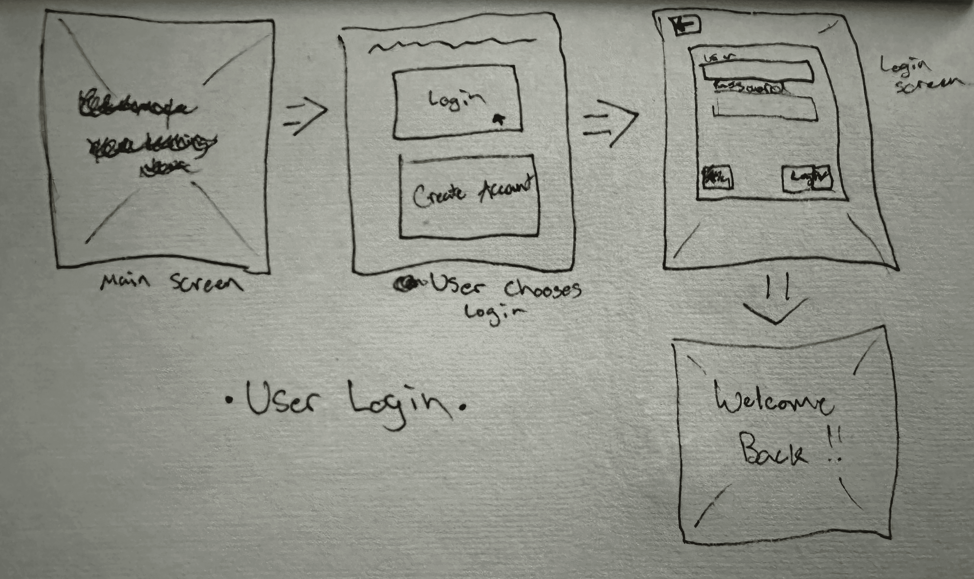
Users completed four task flows:
Create an account
Freemium → Premium upgrade
Log Day 2 progress
Change skill focus
Participants consistently described the app as intuitive, motivating, and fun.
Quotes from testing:
“Feels really simple to track progress.”
“I’d actually use this if I was learning something new.”
Small adjustments, like larger buttons and quicker access to premium, dramatically improved flow.
Validating Through Usability Testing
Based on user feedback, I refined:
Larger tap targets on key actions to eliminate friction
Premium access shortcut directly on the home screen
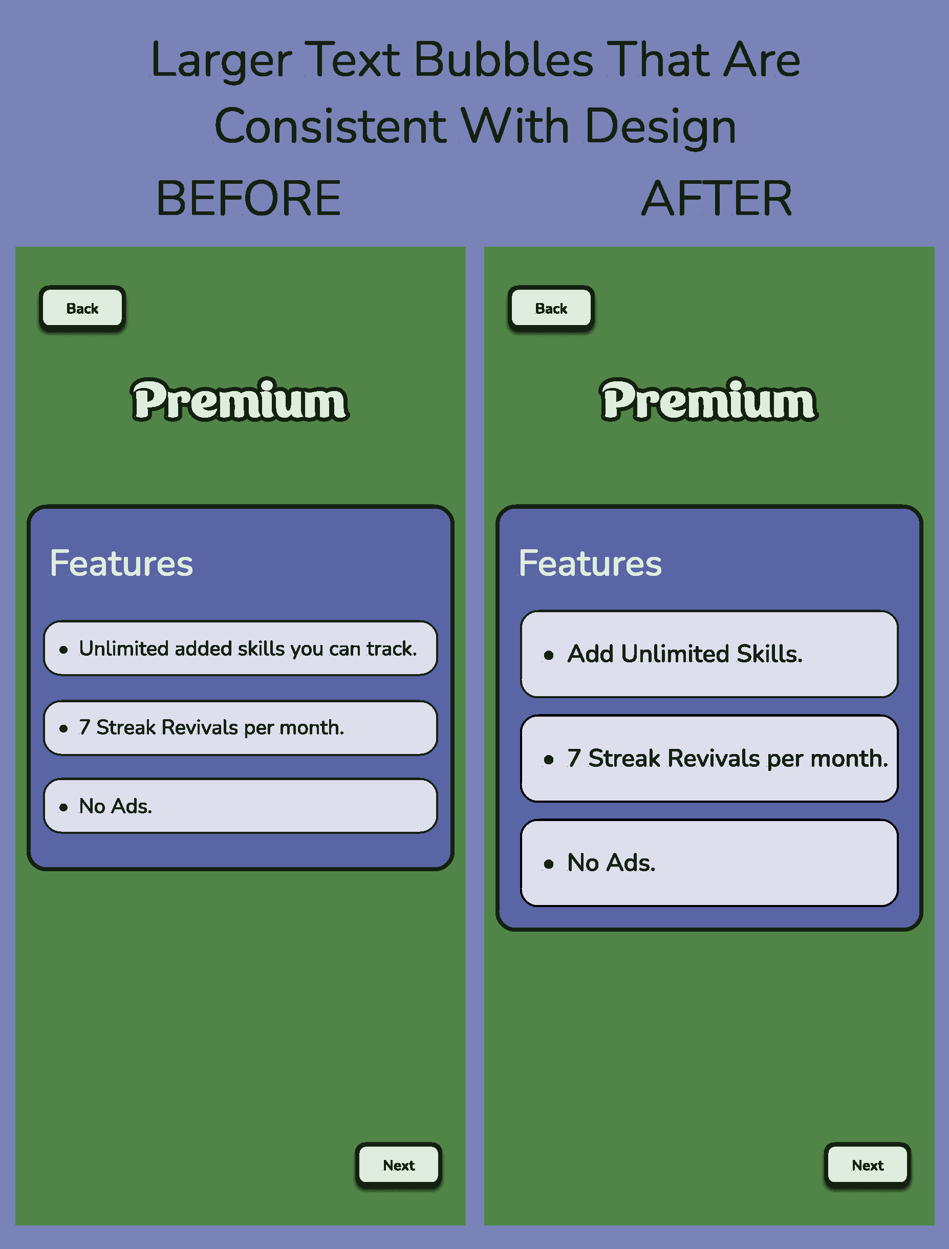
More affirming visual progress feedback to reinforce motivation
These changes improved usability without compromising simplicity or delight.
Reflections: Designing for Motivation, Not Completion
Looking back, the key lesson was that tracking alone isn’t enough, users need emotional reinforcement.
Motivation grows when:
Progress is visible
Achievement feels rewarded
Commitment feels supported
By focusing on consistency, celebration, and accountability, Learny turned learning into momentum, not obligation.
Next steps include exploring social accountability (shared progress), expanding gamified challenges, and personalizing skill pathways based on user habits.
Key Takeaway:
Consistency builds confidence.
Confidence builds momentum.
And when progress feels rewarding, users keep going.

